


Painting: the key to gain space and sensations
Everyone has a favorite color. And we don't necessarily use it often in clothes or accessories, but it is the color that conveys security, happiness or tranquility, or that simply transports us to a place or a pleasant memory. If we dress in a wide variety of colors, why do we always paint our house walls the same white color?
Paint colors can be significant when it comes to feeling comfortable or uncomfortable in a room. And this decision takes on much more weight when we see how the colors and the way of painting the rooms affect the space and its perception.
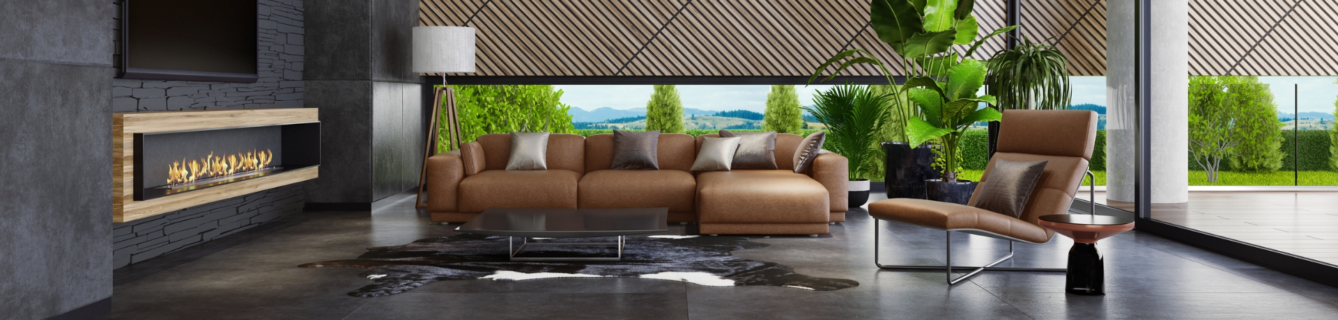
Dark or warm colors
Dark and/or warm colors, such as orange or green, tend to make a space smaller and more welcoming, causing a sensation of proximity and embers. Thus, painting only one wall can serve to highlight a specific point in the room, and painting only the ceiling with one of these shades can result in a lower and more welcoming space in our eyes.
Light or cool colors
Light and/or cold colors, such as white, sky blue or sand, tend to enlarge a space, while favoring emotions related to tranquility and calm. A clear example is the shades that are normally chosen to paint a newborn's room. In this sense, if we choose a cold color only for the back wall of our living room, we will be able to lengthen the space; while if we choose a light tone only for the ceiling, we will gain a feeling of height.
Trends 2022
Everything and the predictions of the experts in the coming years, the easiest way to find out the trends is to live them. With a good part of 2022 lived, we can make a reading of the colors that are being used the most and with what combinations.
From Pantone, an international entity in the field of colors, Very Peri was revealed as the color of the year 2022. It is a blue color with violet-red undertones. It has been, without a doubt, one of the trending tones for the walls of homes, along with other similar ones such as lavender, blush pink or burnt ones close to violet subtones.
Other winning combinations this year have been gray with a dark navy bruise, which fill any space with elegance and minimalism, burgundy with beige, a risky but very interesting combination if you play with furniture and decoration materials, or brown with cream, which follows the trend of playing with different shades of the same color to offer a cozy and harmonious feeling.